

Group Members and Roles
Jessabelle Lau
Project Leader
Lead Graphic Designer
Olivia Baychu
Lead UX/UI Designer
Project Researcher
Vida Kayla Bensing
UX/UI Designer
Elijah Temple
Graphic Designer
Paige Stacey
Graphic Designer
Amanda Spears
Graphic Designer
Feedback Implementation (Week 13–14)
Kayla and I reviewed the feedback. After a long meeting, we determined which suggestions would be implemented. The main adjustment involved the question mark feature. Initially, the question mark icon linked users back to the Help page. However, based on user feedback, it was brought to our attention that users preferred the question mark to provide context-specific assistance related to each individual flow, offering guidance on the specific tasks they need to complete.
Wireframes & Design System (Weeks 8–9)
Kayla and I finalized the lo-fi wireframes and set up the Figma design system. We had to play around a lot with the lo-fi's, specifically for the interactive flows. We needed to make sure that users could have access to all the buttons they needed without overwhelming them. For the design kit, we made sure to include all of our typography, the colors we were using and where we were using them, as well as the buttons.
.png)
.png)
.png)
User Testing (Week 12)
Jessabelle, Kayla, and I conducted one-on-one user interviews. Participants were guided through the prototype and asked to complete tasks, allowing us to assess user navigation and intuitiveness. We learned a lot about our app when we had individuals test it for us.


Hi-Fidelity Mockups & Prototyping (Weeks 9–10)
Six polished user flows were completed by Kayla, Jessabelle and I using team-created visuals. There was a lot of collaboration between Jessabelle and I during the initial prototyping phase. Given that the app was different and incorporated gamification elements, we spent a lot time experimenting in Figma to determine the most user-friendly layout. I was prototyping while designing to test the app's visual presentation. Once the design was finalized, Kayla helped me with prototyping the Dashboard flow.
.png)
Sprint 1
Team Contract
Idea Conception
Problem Research
Project Plan
Business Canvas
Buddie Design
FigJam Brainstorm Session
Accessories, Tank, XP, Store Currency
Survey (validating problem)
Figma Design System
User Flows
User Journey
Sprint 2
Lo-fidelity Wireframes
Hi-Fidelity Wireframes
More Sticker Design
Household Matching Accessories
Background Design
Animations for Buddie Interactions
Tank Treasure Chest Design
Tank Redesign (change to background)
Prototyping Main Flows
Animating Buddie Interactions
Sprint 3
User Testing
Feedback Implementation
Fixing Prototype
Preparing CapCon Assets:
Project Poster
Brochure (Handout)
Printing Stickers
Business Card Design + Printing
Recording Prototype Preview
Starting on Trifold Display
Sprint 1
Goal: Build awareness around water conservation by creating an engaging mobile experience using gamification, supported by a strong brand and design foundation to guide future sprints.
Team Contract & Planning (Weeks 1–3)
We started off by finalizing a team contract, setting expectations, and outlining responsibilities. A detailed project plan, business canvas, and project task list were created to track our workflow and priorities.
Research & Content Development (Weeks 2–4)
We gathered data from 10+ trusted sources on climate change and water sustainability. This research informed user commitments, educational facts ("Did you know...?"), and app potential content.
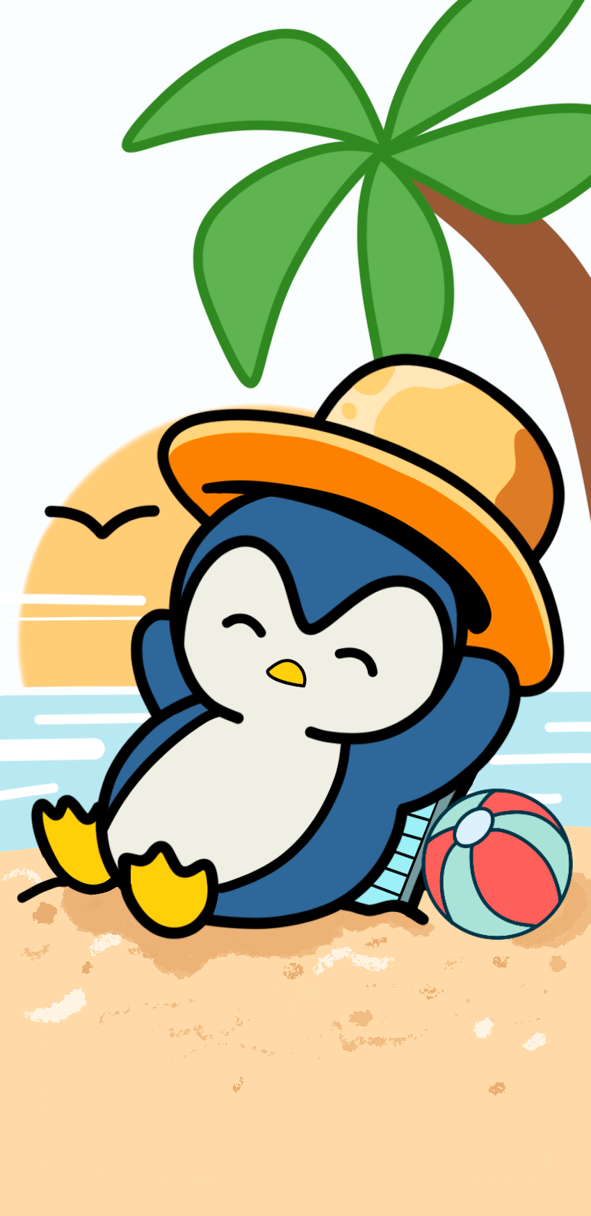
Character & Asset Design (Weeks 2–7)
Each member designed a unique aquatic “Buddie,” later created by Jessabelle Lau into a consistent art style. The idea was that users would be able to select their virtual "Buddie" that they would have to take care of by staying under their water consumption limit. Users can unlock fun rewards and customization options for their "Buddie".


.png)
.png)
.png)
.png)
.png)

Branding & UI Foundation (Weeks 3–4)
We selected a playful ocean-inspired logo and color palette. A brand guideline was created by Elijah Temple, detailing typography, iconography, and tone. A design system was built in Figma to ensure consistency in components.

UX Research & Flows (Weeks 6–7)
Everyone participated in the creation of a user survey was validate our problem and see what the public awareness was. From those insights, we determined was three main areas of importance would be for the user flows. User Flows and Journey maps were then created by the two UX Designers, which are Kayla and I.
_edited.jpg)
Sprint 2
Sprint 2 focused on moving from initial concepts to polished visual assets and interactive mockups.
Key objectives included:
Finalizing lo-fi wireframes
Designing branded graphic assets (icons, backgrounds, stickers)
Creating hi-fi mockups and beginning prototyping
Starting animation work
Preparing for the Sprint 2 presentation
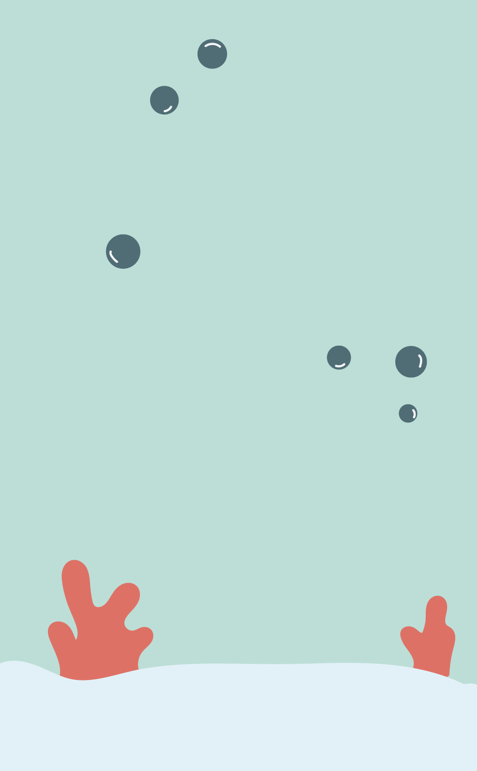
Backgrounds & Layouts (Week 9)
Jessabelle, Elijah, and Amanda created and refined in-app backgrounds for screen layouts. These different backgrounds are a way for users to be able to personalize the app.


Stickers, Scrapbook, Icon Design & Animations (Weeks 9–10)
Jessabelle and Amanda co-designed stickers and for the scrapbook feature. Jessabelle led the creation of cartoon-style icons that aligned with the app’s playful tone, as well as the apps animations. It was important that these stickers felt unique and special so that users can work towards a goal of earning them for the scrapbook flow.


Sprint 3
Sprint 3 focused on usability testing and implementing feedback. In the final stage of the creation of this app we wanted to make sure that it was user friendly and intuitive.